

Buyers move between phone, laptop and tablet before paying. They expect speed, trust and no surprises.
Indeed, if checkout feels heavy, they leave. If it feels easy, they buy. So, prepare now. Ecommerce checkout flow best practices will carry your brand into the era of device-first buyers.
Still, one of my aunts ran a U.S. home décor store with high cart drops. Their checkout process had too many steps and hid shipping costs until the end.
She discussed with me. We fixed it with one-tap pay, synced carts and upfront totals. Customers started finishing orders without hesitation.
Modern checkout needs one-tap logins, synced carts and flexible payment options. Layouts must adapt to each screen.
Accessibility must be built in for all shoppers. Trust signs must sit right where buyers decide.
Whatever, checkout will keep changing. AI will cut wasted steps. Payment methods will adjust by device and region. Privacy laws will add stricter rules. Testing will shift from yearly to monthly.
Ecommerce Checkout Flow Best Practices
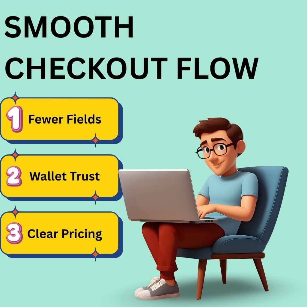
People hop devices. They hate typing. They trust wallets. They expect clear prices. So, you must build for taps and sync progress.
Then, cut fields and offer the right pay options.
One-tap logins (Google, Apple, biometrics) replace long forms
Phones win most sessions. Typing fails there. Passkeys remove passwords and phishing risk. People complete more logins with fewer errors. FIDO Alliance
How results come
Offer Sign in with Apple and Sign in with Google.
Turn on passkeys for accounts.
Keep guest checkout visible at all times.
Use magic links as a fallback on any device.
Proof
FIDO’s 2025 report shows high awareness and active enablement of passkeys across the U.S. and U.K. 48% of the world’s top 100 sites already support passkeys. FIDO Alliance
Cross-device cart sync (let items follow the shopper)
Many browse on a laptop and pay on a phone. So, if the cart dies, the sale dies.
How impact happens
Store the cart in the cloud.
Restore it on login or a magic link.
Send resume links by email/SMS to the exact step.
Turn on Persistent Cart in your platform (Shopify/BigCommerce/Adobe Commerce).
Notes
Set a clear expiration policy. Do not “reserve” stock too long. Sync prices and promos on return. blubolt eCommerce
Auto-fill with AI and saved preferences (fewer taps, faster pay)
Address entry causes typos and drop-offs. Autocomplete cuts errors and time on phones.
How ideas spread
Enable address autocomplete and ZIP autodetect. Suggest valid matches after a few characters. Cache preferred shipping and preferred payment for signed-in users.
Proof
Baymard finds 55% of sites still lack full “automatic address lookup.” That slows checkout. Fix it. (Baymard Institute)
Payment diversity (BNPL, wallets, crypto, local options)
Shoppers choose familiar methods. Wallets cut steps. BNPL lifts order size during promos.
What works now
Put Express wallets first: Apple Pay, Google Pay, PayPal.
Then show cards and BNPL with clear terms.
Order methods by device and region using analytics.
Proof
Digital wallets lead global e-commerce share and keep rising through 2030 (Worldpay GPR 2025). (hkdca.com)
In the U.S. Holiday 2024, smartphones drove 54.5% of orders and BNPL hit $18.2B. Mobile drove most BNPL orders. (Adobe Newsroom)
“Digital wallets are the people’s payment choice.” — Worldpay, Global Payments Report 2025. (web3unplugged.io)
(Crypto remains niche for retail checkout in the U.S./UK. Keep it optional.) hkdca.com
Clear cost display (taxes, shipping, duties) upfront
Surprise fees trigger exits. U.S. shoppers cite extra costs as the top reason to leave.
How progress starts
Show tax, shipping and duties in the cart and summary.
Keep totals sticky on mobile.
Add a shipping estimator before payment.
Mirror the same totals across devices.
What slows checkout the most?
Checkout slows down for four main reasons. Typing on phones drags, but passkeys, digital wallets and autocomplete cut the pain (FIDO Alliance).
Shoppers hate hidden costs that pop up late, so show the full price from the start (eMarketer).
People leave when their wallet or BNPL option isn’t there (HKDCA). And nothing frustrates more than forced accounts—guest checkout should always stay open (Baymard Institute).
Case study (U.S. checkout at scale): Walmart + Klarna via OnePay
In March 2025, Walmart selected Klarna to power installment loans through OnePay, across walmart.com and U.S. stores.
Why it fits here: Walmart places BNPL next to cards and wallets across web, app and store. Shoppers see the same choice on any device.
What to learn: Put wallet and BNPL options where mobile buyers see them first. Keep terms clear. Sync the choice across channels. Company site: walmart.com
Designing a Frictionless Multi-Device Experience
Shoppers switch screens often. They may browse on a phone, compare on a laptop, then pay on a tablet.
If checkout breaks during this journey, sales vanish. A smooth design keeps forms clear, taps easy, trust signals visible and helps close at hand.
Adaptive checkout: layouts that shift by device
A phone screen cannot show the same layout as a desktop. Many stores still use one design for all devices.
This slows buyers and causes exits. Google’s recent INP update now measures how fast clicks respond. A slow checkout lowers trust and rank.
How to design
On phones, use one column. Keep totals and the Pay button sticky.
On desktops, use two columns. Place the form on the left and the summary on the right.
Always show step labels and progress. Shoppers leave if they cannot see how many steps are left.
Preload the next stage after submission. Do not make buyers wait in silence.
Result
Layouts feel natural on every screen. Inputs match the device. Buyers stay in flow and Google records faster interaction speed.
Tap-friendly mobile vs. keyboard-ready desktop
Mobile buyers use thumbs. Desktop buyers use keyboards. If the design ignores this, errors rise and sales fall.
Mobile best practices
Use Apple’s rule of at least 44×44 points and Google’s 48×48 dp for tap size.
Replace dropdowns with radio buttons for shipping options.
Trigger numeric keypads for card fields, ZIP codes and CVV.
Avoid deep accordions. They hide important inputs and create extra taps.
Desktop best practices
Make sure the tab order follows the visual order.
Validate fields as soon as a user leaves them. Do not wait until the whole form is submitted.
Place error text beside the field. Do not push it to the top of the page. Today, one-third of sites still fail at inline validation.
Accessibility updates
Millions in the U.S. and U.K. shop with assistive tech. Failing here blocks sales and risks compliance penalties.
Updates to apply
Target size: keep buttons and inputs large enough.
Accessible authentication: allow passkeys and password managers. Do not block paste or autofill.
Redundant entry: do not ask for details already given.
Voice and readers
Support iOS Voice Control and Android Voice Access. Use clear labels so voice commands can find each field.
Screen readers must announce errors instantly. Move the focus to the first mistake for fast correction.
Dark mode
Respect system settings.
Keep at least 4.5:1 contrast for body text and 3:1 for icons or large text. This ensures checkout is readable in both light and dark.
Extra gain
Better INP also helps assistive users. Trim blocking scripts. Load only what matters.
Trust signals where shoppers expect them
Checkout is sensitive. One doubt can kill a sale. Buyers need proof of safety where they enter details, not at the bottom of the page.
What to show
Place Visa, Mastercard, PayPal, Apple Pay and Google Pay logos next to the payment form.
Add a short line near the Pay button: “We never store full card numbers.”
Keep refund policy and delivery dates visible in the summary.
What to avoid
Badges that sit only in the footer.
Old security seals that do not match your payment provider.
Empty claims like “secure checkout” with no details.
Baymard research proves trust rises most when badges and notes appear beside the fields that ask for payment.
Support at checkout: chatbots and assistants
Many shoppers have last questions just before paying. If no support exists, they drop out.
Best practices
Add chat entry points on shipping and payment steps.
Offer quick answers to common issues: promo code errors, tax differences, or BNPL terms.
If payment fails, transfer to a human agent. Keep the cart intact during that step.
Expert insight
“Shoppers expect payment to work the same across web and app. If a wallet or card fails in one, they will leave. Our job is to remove those breaks and give a clean path everywhere.” — Andrew Proctor, Head of Payments, ASOS, June 2025.
Case study: ASOS + Checkout.com
ASOS teamed with Checkout.com to improve payments on its U.K. and U.S. stores. The goal was better acceptance rates, fewer failures and smoother checkout across devices.
Impact for multi-device shoppers
The same payment methods now show across the web and app.
The system adjusts by region, showing the right local methods before card entry.
If a card fails, buyers are redirected to wallets instead of being forced out.
Lesson to learn
Consistency is vital. Payment options should look the same on all devices. Recovery paths must save the cart, not erase it. Company site: asos.com
Why does the Checkout Flow Still Decide Sales
Checkout is where money is made or lost. It builds trust. It secures loyalty.
Most buyers finish on a phone. They often jump between screens. You must make that handoff faster and simpler than your competitors.
Checkout is now the trust test
A . People judge brands at checkout more than anywhere else.
B . The average cart drop rate is 70%. That is lost profit sitting in carts.
C . Why do they quit? Extra fees (39%). Slow shipping (21%). Forced account (19%). Long forms (18%). Hidden costs kill intent.
D . One-tap options work. Shop Pay and wallets lift completion compared to guest checkout.
Fix it now
1 . Cut fields. Baymard shows top stores ask for 12–14 inputs. Most ask 23+. That is waste.
2 . Place trust notes (returns, SSL, privacy) next to pay buttons. Not buried.
3 . Offer fast wallets: Apple Pay, Google Pay, PayPal, Shop Pay. They lead the market and are rising.
How is mobile-first and multi-device buying changing e-commerce
A . More than half of U.S. holiday 2024 orders came from phones (54.5%).
B . In Q2 2025, e-commerce was 16.3% of all U.S. retail. Mobile drives that growth.
C . Buyers expect one-tap pay and clear costs. Wallets lead global e-commerce by value.
Make it easy
1 . Treat the phone as the first screen. Use large tap areas. Add autofill. Show totals early.
2 . Be open about tax, shipping and duties. Hidden charges cause drop-offs.
3 . Add BNPL and local wallets. U.S. shoppers lean on them, especially in holiday months.
Micro-moments: mobile → desktop → mobile
A . Many start on a phone, compare on a laptop, then pay on a phone.
B . If the cart is not saved across devices, they leave.
C . Use persistent carts tied to login or magic links.
D . Send reminder emails or SMS that lead users to the same step.
E . Keep pages fast. Google’s INP metric measures tap delay. High INP = high drop.
Keep it clear
1 . Store carts in the cloud. Restore them when the buyer logs in.
2 . Keep checkout light. Cut heavy scripts that slow taps.
3 . Follow Google’s June 2025 INP guide to debug slow clicks.
Why do more shoppers drop carts on mobile?
Costs hit late. Extra fees sting more on small screens. Show totals early.
Forced accounts slow buyers. They want guest pay.
Long forms push them away. People won’t thumb through 20+ fields.
Tap delay hurts. If the pay button lags, they quit. Keep INP low.
Wallet gaps. If Apple Pay or PayPal are missing, many users leave.
Case study: Everlane (everlane.com)
Move: Shifted to Shop Pay as core checkout.
Why: One-tap pay, stored details, wallet trust.
Impact: Faster pay flow, higher conversion, less drop-off. Shop Pay now drives a big share of Shopify’s transactions.
Future-Proofing Your Checkout Strategy
Buyers hate entering the same details again. AI now adapts checkout for known users.
If a customer always ships to the same address, skip the address form. If they use the same card, show it first. If they prefer store pickup, highlight that option.
Platforms like Shopify and Adobe Commerce already test dynamic step removal. McKinsey’s 2025 report found checkout personalization can lift conversions by 15–20% when repeat buyers skip fields.
Action points:
Auto-suggest shipping addresses for logged-in users.
Remove unused steps for returning customers.
Save delivery and payment preferences across devices.
Predictive payment suggestions based on device + region
Most buyers drop off if they don’t see their preferred payment method first. Predictive checkout fixes that. Device data tells you what to show first. For iPhone users, surface Apple Pay. For Android, surface Google Pay. For repeat BNPL buyers, suggest Klarna or Affirm upfront.
Worldpay’s 2025 Global Payments Report shows digital wallets now hold over 50% of ecommerce spend worldwide. In the U.S., wallets are growing faster than cards.
Action points:
Order payment methods by device type.
Rank by past buyer behavior in each market.
Update order monthly using analytics.
Regulation updates (data privacy + new EU/US payment security rules)
Laws are tightening on checkout data. In the U.S., California CPRA enforcement now covers e-commerce firms nationwide if they handle CA resident data. In the EU and UK, Strong Customer Authentication (SCA) still applies and now includes stricter exemptions for low-risk transactions.
The U.S. SEC will also require public companies to disclose cyber incidents quickly, which puts pressure on payment security.
Action points:
Add plain privacy text near the pay button.
Support 2FA that works well on mobile and desktop.
Do not store extra buyer data. Keep it minimal.
Review compliance quarterly, not yearly.
Continuous testing: why A/B testing checkout flows is now monthly, not yearly
Checkout habits shift quickly. One design that works in spring may fail by the holiday season. Waiting a year to test is too late.
Baymard’s 2025 research shows 77% of top ecommerce sites still have checkout UX issues that can be fixed with testing.
Action points:
Run monthly A/B tests on steps, forms and button order.
Track drop-offs by device type.
Measure speed using Google’s INP metric for taps and clicks.
Test cost display, shipping choices and payment order.
What will checkout look like in 2030?
By 2030, checkout may not look like a form at all. AI will predict intent and one-tap approval could replace multi-step flows.
Wallets will dominate over cards. Voice and biometrics will replace most typing. Regulation will demand stronger privacy and stricter fraud checks.
The path is clear: checkout will fade into the background. Buyers will pay inside apps, social feeds and even connected devices without seeing forms. Stores that prepare now with adaptive and predictive systems will stay ahead.
Expert insight
“Payments used to be an afterthought. In 2025, they are strategy. By 2030, the best checkouts may be invisible.” — Meron Colbeci, Chief Product Officer, Checkout.com.
Case study: Nike + Stripe
Nike expanded its partnership with Stripe to upgrade checkout across U.S. and European markets. The focus was on flexible payment options, adaptive routing and compliance with new regional rules.
Impact
Wallets and BNPL are placed upfront across Nike.com and the Nike app.
Stripe’s routing cut failed transactions, especially on mobile orders.
Checkout became consistent across devices and countries.
Lesson to learn
Future-proofing is not a one-time upgrade. It means using providers that evolve with buyers, devices and laws. Company site: nike.com
Conclusion
So, checkout is not the signature on the deal. A strong flow is like a polished pitch; it wins without noise. Each step is precise, each click a promise kept. When the path is clear, revenue moves like capital in open markets.
Think of checkout as your trading floor: speed, trust and timing decide value. The brands that master it do not just process payments. They build loyalty, like firms that turn customers into long-term investors. Even the leanest shop can stand with giants when the final step feels effortless.
FAQ
How many checkout steps work best for buyers?
Most shoppers prefer 2–3 steps. More steps feel slow and push people away. Combine shipping and billing if you can. Always show a progress bar so buyers know exactly where they are.
Should guest checkout always be an option?
Yes. Many buyers don’t want to register before buying. A guest option removes that barrier. After payment, you can invite them to create an account in one click.
Where should coupon fields be placed?
Keep coupon fields visible but not distracting. Place them on the cart page or at the start of checkout. If buyers can’t find it, they may leave the site to hunt for codes and not return.
How important is checkout page loading speed?
It’s critical. A slow page makes buyers doubt the site and abandon payment. Optimize images, trim extra scripts and keep checkout clean. A page that loads fast feels safe and reliable.
Should stores allow buyers to edit carts during checkout?
Yes. Let buyers update quantity, remove items, or change shipping directly inside checkout. Forcing them to start over frustrates them and leads to drop-offs.
Do confirmation pages affect buyer trust?
Yes. A clear confirmation page reassures buyers that the order worked. Show an order number, delivery estimate and customer support link. Always follow with a confirmation email.
How can checkout design reduce buyer stress?
Use plain words and short instructions. Group related fields together. Show error tips instantly when something is wrong. A simple, clean flow keeps buyers calm and willing to finish.
Should stores allow multiple shipping addresses in one order?
Yes, especially for gift shops or corporate orders. Shoppers like sending items to different addresses in one checkout. This saves time and makes big orders easier.
Does the design of error messages matter?
Yes. Buyers get frustrated if errors are unclear. Place the message next to the field and explain what to fix. For example: “Card number must have 16 digits.” This helps shoppers correct mistakes quickly.
Is offering checkout in multiple languages useful?
Yes. Buyers feel more comfortable when checkout is in their language. Global stores should add options like Spanish, French, or German. Even U.S. stores benefit from Spanish checkout for local customers.