
Every business fights for space in the same feed, the same search bar and even the same second of attention.
That’s why product and packaging design now works as the first voice of any business. It speaks before your ad does and it stays in memory longer than a slogan.
I remember one of my Facebook friends who sold home-tech gadgets. The products worked perfectly, but the boxes looked dull and old-fashioned than competitors. Buyers liked the features but didn’t feel the brand.
So, he decided to rebuild everything: clear type, soft color, recyclable box and a tiny QR link that opened setup videos.
A month later, customers began posting unboxing clips without being asked. That design change did what months of ads couldn’t: it made people care.
Still, design is now about emotion and proof. Buyers read tone through color, texture and how a box opens. They notice clean layouts and packaging that match what a website promises.
Product and Packaging Design
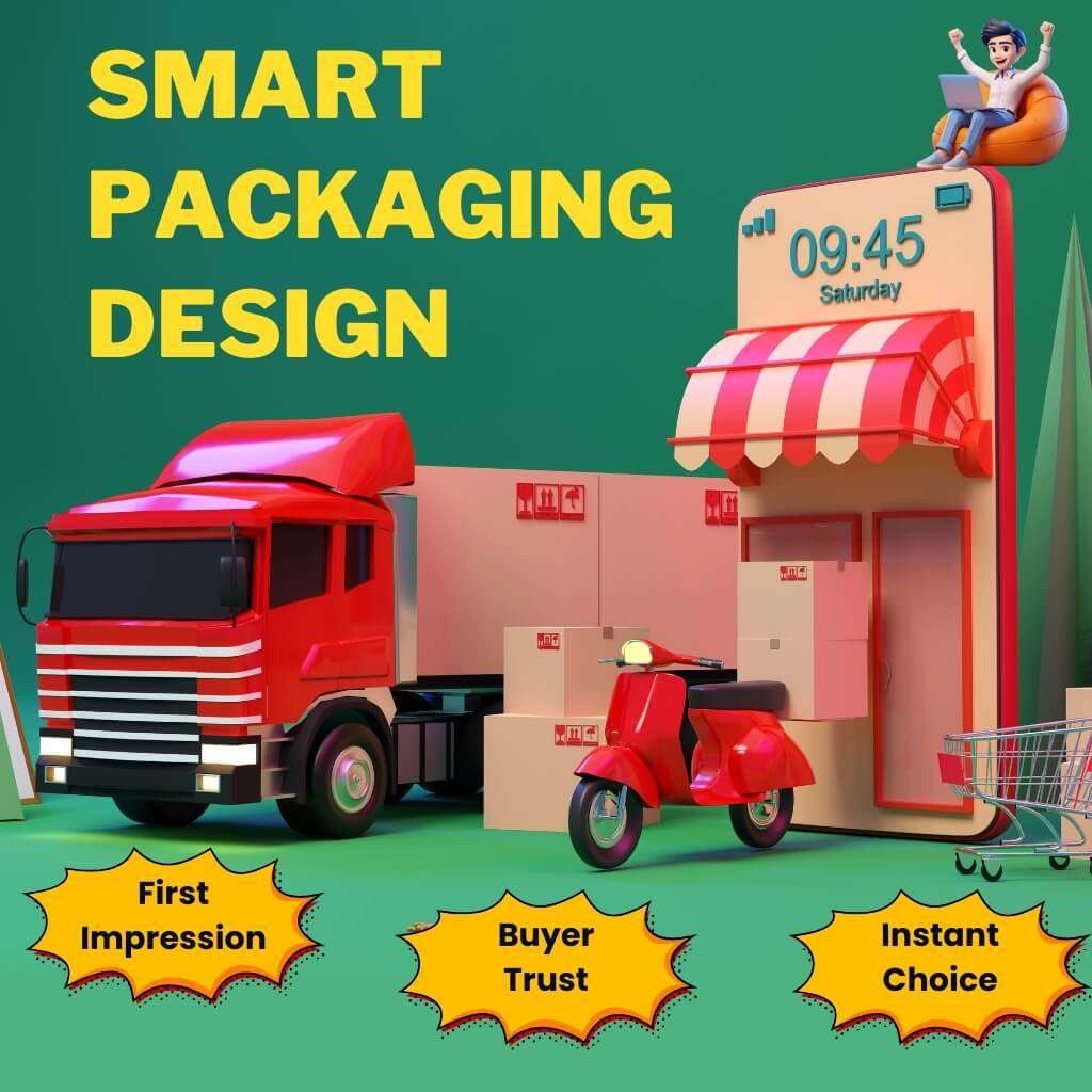
Packaging is a full experience, the first demo, the brand’s voice and often the main reason a buyer decides to trust or skip a product.
Shoppers now make purchase choices faster than ever and design plays the biggest role in that instant judgment. They want clarity, safety and convenience.
A. The Modern Definition (Not Wrapping, but Story and Use)
Product and packaging design today combines communication, usability and emotion. It tells a story while guiding use. A pack must instantly show what it is, who it’s for and why it matters.
The front panel should do three things:
1 . State the product name clearly.
2 . Mention the size or count.
3 . Add one short benefit line.
Side and back panels can handle instructions, materials and disposal guidance.
A small QR code can lead to proof pages or extended content.
Use one or two fonts and keep them consistent across all SKUs.
This consistency builds recognition and trust.
Tip: Avoid decorative clutter. A clean, informative design always performs better than an artistic but confusing one.
B. Why Packaging Is Now Brand Voice, Trust and Digital Reach
The pack speaks before any advertisement does. It’s the brand’s first signal of quality and personality. Consumers trust clear and legible packs far more than crowded ones.
Social shopping has become a major buying channel. U.S. social commerce sales are projected to pass $115 billion, driven by TikTok Shop, Instagram and YouTube Shorts.
Buyers often see your packaging first on their phone screen, not in a store aisle. That means every word and color must work at a mobile scale. If the name and benefit aren’t visible at 200 pixels wide, you’re losing sales.
At the same time, state laws are tightening. California’s SB 54 now requires accurate packaging material reporting. Other states, including Colorado, Oregon and Maine, are following the same model. Every claim printed on a pack must be verifiable.
Action Steps:
1 . Design for mobile readability first.
2 . Test your pack design at small resolutions and in dark mode.
3 . Use GS1’s 2D barcode format, which will replace standard UPC codes by 2027.
4 . Add a QR that leads to sourcing, recycling, or brand proof pages.
C. Design, Psychology and Sustainability (The New Balance)
Buyers react faster than they think. They use visual signals colors, typefaces, icons and layout to make quick judgments. Those few seconds decide whether they feel safe or skeptical.
Visual simplicity wins. Clean layouts reduce friction and increase trust.
Too many design elements confuse the eyes and slow the brain.
Yet, a growing segment now looks for eco honesty, not green slogans.
They expect specific claims like “100% recyclable aluminum can” or “50% post-consumer material.”
Generic terms like “eco-safe” or “planet positive” no longer work.
California’s 2025 regulations even penalize vague or unverifiable green claims.
What to Do:
1 . Replace buzzwords with factual lines. Example: “Recyclable curbside in most U.S. cities; check local rules.”
2 . Add a QR with a short “materials map” showing sourcing and disposal info.
3 . Use calm color palettes with one accent per product. This signals quality and makes items easy to identify on the shelf and online.
D. Influence of Packaging Trends (Type, Structure and Palette)
Design styles are shifting again. Let’s see:
Typography
Big, clean sans-serif fonts now dominate. One accent serif can soften the tone. Limit yourself to three weights max. A recent study found that typography, color and layout together strongly influence buying intent.
Structure
Consumers want easier handling more than glossy effects. Packs that open smoothly, reseal properly and store neatly drive repeat purchases. Tear-assist tabs and reseal zippers are now top-rated features.
Color Palette
Warm neutrals are everywhere this year. Pantone’s Color of the Year — Mocha Mousse (17-1230) — captures this shift perfectly. It conveys warmth, calmness and quality. It fits food, wellness and home brands especially well.
Technology
Interactive packaging keeps expanding. QR and NFC codes are now standard tools for trust and engagement. The retail industry will fully switch to 2D barcodes by 2027 under GS1’s “Sunrise 2027” plan. Adding them now gives brands traceability and stronger post-purchase data.
Tips:
Test text legibility under different lighting and backgrounds.
Pair neutrals with one bright accent color per SKU.
Add QR codes that include disposal guidance for U.S. regions.
E. Why Do Buyers Judge a Product by Its Box First?
Because first impressions decide trust. In a store or online, people give a product only a few seconds. They scan for familiar cues: clean layout, clear benefits, readable size and visual safety. These small design signals tell their brain, “This feels reliable.”
Multiple studies confirm that visual elements influence buying intent.
Even when two products are similar, the one with a cleaner, more confident design wins.
Quick Fixes:
Focus on the top third of your pack; it’s what shoppers see first.
Use contrast to separate text and background.
Keep your main message under 10 words.
F. “Instagrammable Moments” (When Unboxing Becomes Marketing)
Social sharing has become a strong marketing process. TikTok’s #packingorders and YouTube’s unboxing videos have billions of views. People love watching products being opened and that moment shapes perception.
Think of your box as a stage. When it opens, what will the buyer see and feel? A simple thank-you message, inner color pop, or hidden quote can turn a customer into a promoter.
Print your social handle or hashtag inside the lid. Place your logo where cameras naturally point during unboxing. Add a QR linking to a “thank-you” page or loyalty offer. Interactive design connects emotion to action and drives repeat visits.
G. Packaging as the Complete Shopping Experience
Today, packaging must work in two worlds: digital and physical.
Buyers meet your product first online, then confirm in stores. The design, color and headline must match across both. Consistency builds recognition and prevents confusion.
Price and quality still close the deal, but clear copy and true claims make the decision easier. Transparent language also reduces returns and bad reviews.
Do This:
Photograph every SKU in three views: full, hand-held and shelf.
Keep the same wording on packaging, website and QR content.
Follow California SB 54 updates to keep your claims legally safe and accurate.
Expert Insight
Leatrice Eiseman, Pantone Color Institute:
“Mocha Mousse expresses a level of thoughtful indulgence.”
Warm neutrals connect emotional comfort with modern design.
What Is the Modern Product and Packaging Design Process
Let’s see how top brands now design packages faster, smarter and validated using real tools and real consumer feedback.
A. Market & Audience Research Using AI-Based Insight Tools
You must begin with insight. If you start by drawing, you risk misfit.
What to research
1 . Which packaging styles dominate your niche (colors, shapes, materials)?
2 . Which visuals trigger complaints (e.g. misleading images, hard open, hidden text)?
3 . Geographic and regulatory constraints (state laws, recycling infrastructure).
4 . Distribution and cost constraints (which materials ship cheaper, what weight limits matter).
How to do it with AI tools
1 . Use trend-analysis platforms that crawl social media, eCommerce listings and design galleries. They extract color palettes, typography and structural cues.
2 . Use image clustering AI to pull top 100 competitor package images and group by style, to find gaps.
3 . Use AI prompt-to-render tools (e.g. Packify.ai) to generate dozens of packing layout ideas instantly. packify.ai
4 . Use brand-insight tools like Sourceful, which combine human expertise + AI to forecast material trends, climate impacts and design feasibility.
What you end with
A visual “trend board” of competitor packaging + gaps your brand can fill.
A prioritized list of permissible materials and cost boundaries.
A visual direction hypothesis (e.g. “warm muted earth tones + matte finish + single accent”).
B. Crafting a Creative Brief That Merges Visual Identity + Brand Goals + UX
Once research is solid, you write the brief that guides design.
Essential parts of the brief:
Brand Core Statement
Say warmly who you are, how you speak and what you promise.
Design Mission
What the packaging must do is stand out online, read on a phone, stack on a shelf and resist wear.
User Experience Intent
How customers open, reuse, store and dispose. What first impression do you want?
Technical Boundaries
Material choices, dieline constraints, finishing types, color limits, printing tolerances.
Visual Inspirations & No-Go’s
Mood boards, competitor designs, colors to avoid and logo layout samples.
Validation Metrics
Test score thresholds: readability at < 200 px, “first impression trust” survey and photogenic score.
This ensures every designer or stakeholder works toward the same target.
C. AI in Packaging Design: Concept Generation, Layout Testing, Virtual Mockups
AI helps you explore and test far more options than humans alone.
How brands use AI in 2025
Generate dozens of layout variations from prompts (e.g. “earth tone wellness box with matte finish”).
Auto-test readability by simulating blur or small-res viewing.
Generate 3D renders from your 2D artwork (so you can see how folds, shadows and edges behave).
Optimize material usage and placement (fold lines, panel bleed, waste minimization).
Run predictive eye-tracking: which area will attract gaze first — your logo, benefit text, or call-out badge?
Caveats
AI sometimes distorts logos or color accuracy; always correct manually.
AI doesn’t know brand nuance — human judgment still leads.
Use AI output as drafts, not final decisions.
With AI, you shrink iteration time dramatically. Many cycles you used to do in weeks, you can now do in days.
D . How Do You Test a Design before Printing?
Testing saves you from expensive mistakes. Here are methods:
1. High-fidelity digital mockups
Render 3D models with camera rotation, shadow, light and material finishes.
Simulate shelf placement, handheld views and mobile thumbnails.
2. Low-cost physical prototypes
Print on cheaper stock. Fold and assemble.
Check edges, alignment, color shifts and fold accuracy.
3. Pilot run on actual materials
Use the same substrate, ink and coating.
Print a small batch — maybe 50–100 units.
4. User testing/photography tests
Show prototypes to a sample of users. Take photos under real lighting.
Photograph packaging in UGC-style settings (kitchen counter, living room, desk).
Vote or rank variants by clarity, trust and appeal.
5. Analytics & metric scoring
Create quick polls.
Use heatmaps on digital mockups to see gaze zones.
Set minimum thresholds (e.g. 80 % readability at 150 px, 70 % positive emotional response).
These combined methods catch nearly all mistakes before mass printing.
E. Prototyping with AR & 3D Visualization Tools for Faster Approval
AR and 3D tools bring virtual packaging into real space.
What do you do with AR / 3D
Overlay the box in a user’s real environment (counter, shelf, hand).
Rotate and zoom the package to see join lines, shadows and textures.
Simulate how light hits the finish (matte, gloss, soft-touch).
Preview how logos wrap around edges or seams.
Some AR tools let users tap panels for hidden content or interactive reveal.
Brands use this to preview how design “feels” in the world without printing. It speeds stakeholder buy-in and reduces surprises.
F. Gathering Real-World Feedback Before Final Print
You need human validation, especially from your target audience or creators.
Feedback sources
Send prototypes or AR links to micro-influencers or brand fans and ask them to record real unboxing and comments.
Use remote tools to show designs and collect ratings (trust, clarity, desire to buy).
Ask open questions: “What’s the first word you think of?” “Would you share this unboxing?” “What material do you think this is?”
What you do with feedback
Tally common complaints or perceptions.
Highlight potential confusion (names, benefits, color).
Iterate again — maybe you need better contrast, or change accent color, or simplify graphics.
This validation ensures that your final design works in the real world, not just in theory.
Case Study: GEODIS: Smarter Beverage Packaging Design
Logistics leader GEODIS helped a U.S. beverage brand redesign its packaging to cut costs and improve brand appeal.
The old boxes were large, heavy and wasteful. GEODIS introduced custom-fit packaging that used less material but looked more refined.
They also removed plastic tape and simplified closure systems. These small upgrades created big results.
Packing speed rose from 300 to 1,600 units per hour. The company saved over $500,000 a year in labor, materials and freight.
The new design met Amazon ITSA standards and reduced product damage during delivery. It also created a stronger, more unified shelf presence. This project proved that efficiency and good design can work hand in hand. error
Why Do Some Packaging Designs Fail Even with a Great Product
Even good products fail when packaging confuses, misleads, or breaks too soon. Every design flaw becomes public feedback. Let’s analyze the most damaging mistakes and the exact fixes that brands now apply.
1. Overdecorating (clutter that buries value)
Too many colors, fonts, icons, or badges make packaging look noisy.
Buyers can’t find the main benefit and lose confidence.
E-commerce images shrink to thumbnails, so crowded art turns unreadable.
According to NielsenIQ’s 2025 Design Impact review, products with clean layouts drive 30–40 % higher shelf recognition than those overloaded with details.
Fix:
Strip the front to one focal image, one headline and one call-out.
Keep supporting claims (e.g., “vegan,” “cruelty-free”) on a side panel or under a QR code.
Use consistent spacing with at least an equal margin on all edges so elements breathe.
Review mockups at both shelf size and 200-pixel thumbnail; delete anything invisible at that scale.
2. Poor readability (small type and low contrast)
Tiny fonts and weak contrast are still among the top reasons for poor conversion.
If people squint to read ingredients or usage, they assume the brand hides something.
Dark grey text on a tinted background fails ADA contrast guidelines and performs badly in phone photography.
Fix:
Keep body text ≥ 8 pt on print and ≥ 12 px on digital labels.
Maintain a minimum contrast ratio of 4.5 : 1 (WCAG 2.1 AA).
Test with grayscale filters and under fluorescent and warm light.
Print prototypes and read from one meter away; if a stranger can’t read it, enlarge it.
3. No accessibility (ignoring tactile and cognitive needs)
Accessibility is not only ethics; it’s business protection. When packs feel identical, people with low vision or in low-light conditions make errors and leave negative feedback.
The Herbal Essences team (Procter & Gamble) solved this by adding tactile stripes on shampoo bottles and circular dots on conditioners.
It helps millions with vision loss and users who simply can’t read in the shower.
Domino Printing supplies coding and marking solutions that print braille and raised indicators directly on packaging lines, helping other brands scale similar features. (domino-printing.com)
Fix:
Add a small ridge, texture, or cap variation to help users tell products apart by touch.
Use large, high-contrast icons (sun for day, moon for night, etc.).
Include braille or raised symbols on premium SKUs when possible.
Validate with testers who rely on tactile cues before rollout.
4. Vague green claims (empty words that invite penalties)
Words like “eco-friendly,” “green,” or “sustainable” without context now trigger both skepticism and legal risk.
False or unclear claims lead to label corrections, bad press and customer distrust.
Fix:
Replace vague terms with quantified facts: “Made with 70 % post-consumer recycled paper.” “Aluminum can — recyclable in most U.S. curbside systems.”
Add a QR or 2D code linking to the verified data source or LCA summary.
Review language with legal or sustainability officers before printing.
Never copy competitor wording; each claim must match your own supply chain.
5. Weak structure, fragile builds that cause returns
Good graphics can’t save weak packaging. Tabs that tear or lids that crush lead to damage, waste and refund claims. A single failure video on TikTok can reach thousands of viewers.
E-commerce brands report that package damage ranks among the top three causes of poor reviews.
Fix:
Run drop, compression and vibration tests using ASTM D5276 or Amazon ISTA 6A standards.
Add extra board strength at hinge points or corners.
Use tear-assist cuts instead of deep slits that rip panels.
Prototype with real product weight before mass run.
Document test results; retailers increasingly request proof of durability.
6. Disconnected design (inconsistent branding across formats)
Many brands still forget to align physical and digital packs. A color that looks rich on matte paper can look dull on screen. This breaks recognition and hurts ad performance.
Fix:
Calibrate color with Pantone Connect or Adobe Color Checker.
Use the same type hierarchy online and offline.
Keep headline text identical across package, PDP and ad creative.
Review final files in CMYK for print and sRGB for digital to ensure a match.
The Future Look (Where Product and Packaging Design Is Headed)
Packaging now connects product, data and behavior. Circular systems grow. 2D codes link packs to living pages. AI speeds concept work and testing, but people decide taste and story.
A) Circular design rises (eco-friendly product design meets connected packs)
Brands move from single-use to systems. They design for reuse, refill, repair and verified recycling. U.S. policy pushes this shift and brands respond with mono-material packs, refill pouches and paper carriers.
The Sustainable Packaging Coalition 2025 Trends Report calls 2025 a “watershed” year as EPR laws roll out and states redefine what counts as recyclable. That forces clear labels and better end-of-life paths.
Circular programs also pair with connected packaging. QR or 2D codes send buyers to disposal steps, return points, or refill maps.
The Ellen MacArthur Foundation continues to rally large brands to eliminate waste and keep materials in use. U.S. coalitions now plan refill initiatives to meet EPR targets in the next cycle.
What to do next
Choose mono-material structures where possible.
Offer refills where shipping weight and margins work.
Add a QR / GS1 Digital Link to show exact local disposal or refill options.
B) AI in packaging design (concepts faster, layouts cleaner, testing deeper)
AI speeds up steps that used to take weeks. Teams generate variations, refine type hierarchy and render 3D mockups from flat art.
Some workflows even add emotion scoring to check if visuals signal calm, energy, or premium at a glance. Designers still choose the final look; AI just widens the option set.
AI also reduces waste. You test more ideas before printing. You preview glare, folds and edges in renderings.
You then move to small pilot runs with fewer surprises. This saves time and cuts material scrap during approvals.
What to do next
Use AI to explore layout families under one brief.
Run emotion checks on thumbnails and shelf views.
Keep a human review to protect tone, legality and brand fit.
C) Digital + physical identity merge (packs join a connected brand system)
By 2027, U.S. retail plan to read 2D codes at checkout. Many brands already add GS1 Digital Link QR on packs.
One scan can open verified ingredients, allergens, batch data, how-to videos, disposal steps and loyalty.
This shift improves safety, recall speed and product pages. It also helps creators and marketplaces because the same code powers both POS and consumer info. gs1us.org
Major companies endorse the move and are preparing lines now. P&G and Kenvue support the Sunrise 2027 transition.
PepsiCo routes scans to SmartLabel pages that update details over time. These systems close the gap between the box, the shelf and the phone.
What to do next
Add 2D codes now; keep UPC for stores that still need it.
Map the scan journey: product page, usage tips, disposal proof and warranties.
Use one code standard across SKUs to simplify operations.
Will AI replace human creativity in design?
No. AI can draft, rank and simulate. It cannot sense culture or set taste on its own. Industry guidance in 2025 frames AI as assistive.
Designers still write the brief, judge nuance and craft voice. Use AI to widen choices and remove grunt work. Keep humans in charge of story, ethics and legal claims.
D) 2025–2030 forecast (how packaging trends evolve)
Policy pressure grows. More U.S. states adopt EPR. Definitions of “recyclable” tighten. Labels must show real recovery paths.
2D codes go mainstream. Retailers scan them. Consumers expect them. Packs become entry points to living content.
Refill and reuse scale in select categories. Beauty, cleaning and beverage lead in pouches, tablets and paper carriers. Brands tie programs to loyalty and local pickup.
AI moves upstream. Teams bake AI into research, wireframes and 3D. Human editors guard tone and truth.
How to stay ready
Build mono-material ranges with a refill lane for top SKUs.
Design every panel for phone viewing first.
Ship with 2D codes and a content playbook behind them.
Track state rules monthly and adjust claim wording.
E) Case study (new): Kiehl’s (U.S.) (refills meet connected content)
Kiehl’s (a L’Oréal brand) added refill pouches for top products and now produces them in-house in Piscataway, NJ.
A pouch can cut plastic use by up to 81% versus a comparable jar. The brand pairs refills with education and content, guiding shoppers to options on its site and stores. L’Oréal+1
Signals to watch: Industry coverage in 2025 credits refill growth and strong circular messaging.
External reporting notes gains in refill adoption and lower plastic use year over year. This shows a path where eco-friendly product design and digital guidance work together at scale. See Kiehl’s refill hub for formats and claims.
Kiehl’s refills: company page — kiehls.com/skincare/refills. kiehls.com
Thus, great product and packaging design keep working after launch. It explains fast. It feels good in the hand. It links to proof and help. That mix turns a box into a constant seller on the shelf, on a phone and in a friend’s video.
Conclusion
Summing up, design is your quiet salesman who confirms deals without a word. It doesn’t decorate; it persuades. Good packaging introduces your brand before you do. Product and packaging design don’t just hold your product. It carries your reputation, your promise, your future.
FAQ
How does color choice in packaging affect buying decisions?
Color works as emotion, not decoration. Warm hues feel personal and cozy; cool tones suggest balance and trust.
A consistent color palette helps buyers recognize your brand instantly on the shelf or screen.
Shoppers often decide within seconds based on color comfort, long before reading a label.
Why do premium brands use minimalist packaging?
Minimalism signals confidence. When space surrounds the product name, it feels important. Clean layouts also photograph better for eCommerce and influencer posts.
Buyers associate minimal design with quality, honesty and calm, three traits that support repeat sales.
How does packaging design influence online conversions?
In digital stores, packaging acts as the first thumbnail. Clear visuals and readable text reduce hesitation and clicks away.
Images that show front, side and open views increase trust and conversion rates. Online, buyers can’t touch; so packaging clarity replaces physical feel.
Can texture or material design really impact sales?
Yes, people judge with their hands as much as their eyes. Soft-touch finishes, matte laminations, or embossed logos create sensory memory.
A good texture makes people hold the box longer, which increases emotional link and buying intent.
Why do buyers connect more with storytelling on packaging?
A short line or symbol that tells origin or purpose builds trust. People love stories they can retell, “made by small farms,” “crafted in small batches.” Micro-stories transform packaging from container to conversation. That emotional tie turns first-time buyers into loyal ones.
How does seasonal packaging influence repeat sales?
Limited editions create urgency and collection behavior. A fresh color or graphic tied to a season keeps the brand visible and relevant. When done tastefully, seasonal designs invite social sharing without losing identity.
How does packaging affect brand recall after purchase?
Memory connects to color, texture and opening rhythm. A unique unboxing sound, fold, or message stays in the mind. When users reorder online, those small cues help them find the same product again without confusion.